Analyzing New York Times Bestseller Covers
By Katie Temple
At the beginning of this project, I sought out to see if there is a trend between book covers and their popularity (basically evaluating whether people "judge a book by its cover" or not). This is in no way an exhaustive study, but rather peeking over the edge.
I found a list of every New York Times Best Seller in the number one position. From there, I narrowed my options down to those in the adult fiction category. Using Image Macroanalysis in Javascript, or imj, I spliced together covers from Janurary 2010 to mid-April 2017 (a total of 235 book covers). The Times best-seller list goes back to 1931, and if I had the time I would have loved to see any trends over its entire stretch to-date. I do wish I were able to use a larger set in general, though I had to look each image up individually and make sure it matched the correct publisher and date.
Montage

This montage took a while to get just right. I had a hard time trying to get the images to line up in chronological order. At first, I had saved each picture into a folder matching the year its cover corresponded to, and within that each image was titled using its month and day. However, in using imj, the images were scrambled out of folder-order. I decided to go through each image and give it it's own sequential name (all 235) and put them into one large folder. This did the trick, and the images lined up left to right, earliest at the top.
One major give away that the montage at first wasn't quite right was that the James Patterson series "Women's Murder Club" each had a large number on its cover corresponding to the number book in the series. So, when these numbers were not in numberical order, I knew something was wrong. You can also see that large text on the covers is fairly popular. In many cases, the author's name is even bigger than the book title itself. This works off of consumers' familiarity with a popular author to get their attention. In the other cases, the words are meant to stick out, to make themselves known, and to root in consumers' heads so that they can remember the title later.
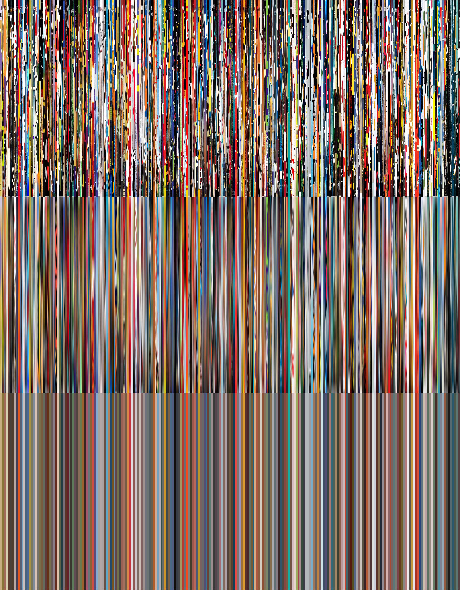
Barcodes
To the right are compilations of the book covers all squished together. The top is the plain barcode image, the middle is a blurred/smoothed version, and the bottom shows the average color of each cover. Altogether, these three barcodes show the progression of bestseller covers over the course of six and a half years.
The progression of the images from normal to blurred to the single-color is to help make visible the color variation, since the first image seems more like static than anything. Going left to right, the images start with 2010 New York Times Bestseller "The Help" by Kathryn Stockett (you can see the sliver of yellow and purple) to 2017's "The Black Book" by James Patterson and David Ellis (the black, white, and red).
You can see where multiple bands blend together, where colors of covers are similar for a few weeks in a row. Many collections of bands have similar tones, most notably where neutral and bold tones group together. As the years go on, you can see the average color of the book covers gets bolder and brighter. This is can be a telltale sign of pubishing companies using eye-catching color schemes to draw in potential book buyers. More and more books are being sold and the competition for readers' attention is becoming tougher, so what better way to lure consumers than to catch their eye?
Maps

The maps above and below are mappings based solely on appearance. Above, you will see the book covers graphed based on hue (x-axis, or horizontally) and saturation (y-axis, or vertically). Interestingly enough, the image vaguely reminds me of a world map focused on the Pacific Ocean. You can also see a rainbow of sorts, though it is apparent that red/orange and blue are dominant colors. These bright colors are striking and demand attention. Digging deeper, the many warm colors are exciting to the eye; they evoke strong feelings (such as power and passion) in people and are therefore used in many design elements of the book covers.
Below, you will see the covers graphed by red (x-axis) and blue (y-axis).

This shows that dark and bold colors are more popular than light and mild colors. Bright text on a black background is more flashy than dark text on a light background. The darker colors can also subtly make the books seem mysterious and inviting, something that would definitely make readers interested!
Overall, this image set—comprised of the covers of 235 best-sellers and organized in various layouts—shows that a book's popularity correlates with its cover image. Publishers seek to stand out against competition by using large text and vivid colors. By no means should this mean you must avoid books with covers that get your attention, however. I admit that even I may be drawn to a book simply because I think the cover is pretty.
Just remember this: as in life, beauty comes in many forms.